Announcement
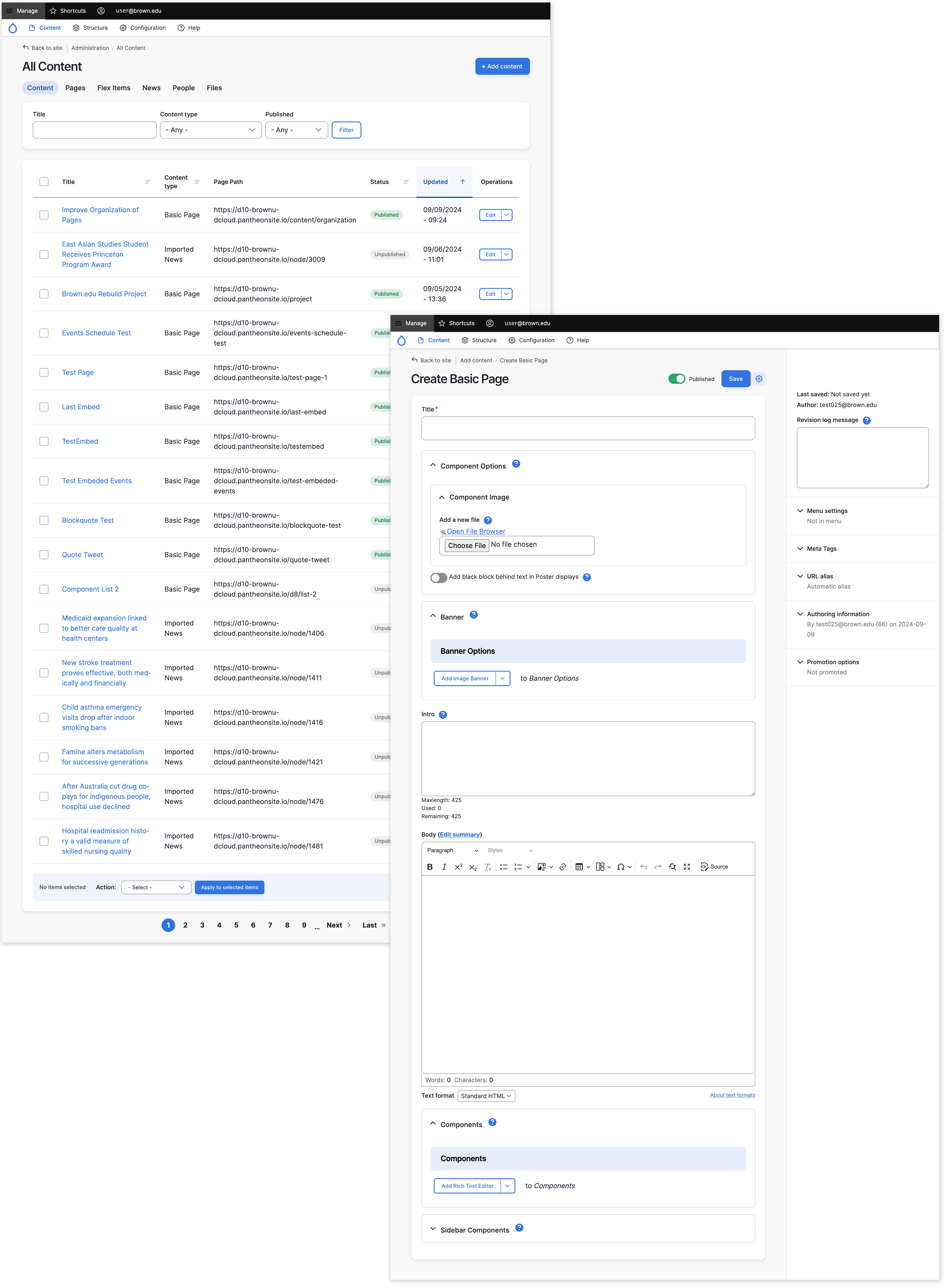
This September, Brown will perform a major system upgrade for all sites hosted on Drupal Cloud. After the upgrade, editors will notice significant changes to the Drupal Cloud interface used for creating and maintaining webpages. This includes updates to the content listing page, editing screen, and admin toolbar. The new version features a clean, modern visual theme, giving it an updated look and feel.
Although the appearance of the Drupal editing screens will be different, they will still be intuitive, and most of the items used by web content editors (admin buttons and links) will be in the same place.
Some of the specific improvements include:
Modernized User Interface
The entire user interface for website editing will receive a comprehensive modernization. Given that the last significant update to Drupal's editing interface occurred in 2011, these enhancements will align the system with contemporary design standards.

Enhanced Rich Text Editing
Rich text components have a number of new features to make creating and editing content easier.
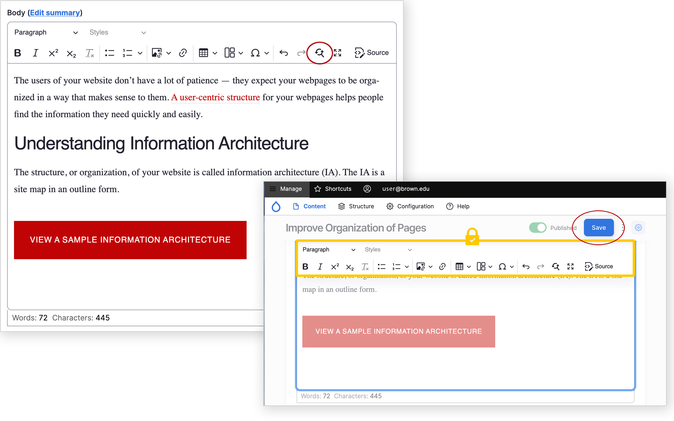
The display of content when editing now more closely matches the public-facing view:
- Headings and paragraph text aligns with the size and font website visitors experience
- Links appear in the proper color
- Buttons, Link Groups and other applied styles display properly
We've also added new functionality, including:
- Find and replace to speed us editing tasks
- Word and character count to help gauge content length
- A 'sticky' toolbar to keep the editor buttons available when scrolling through longer content
- The Save button is also 'sticky' and is now located at the top of page

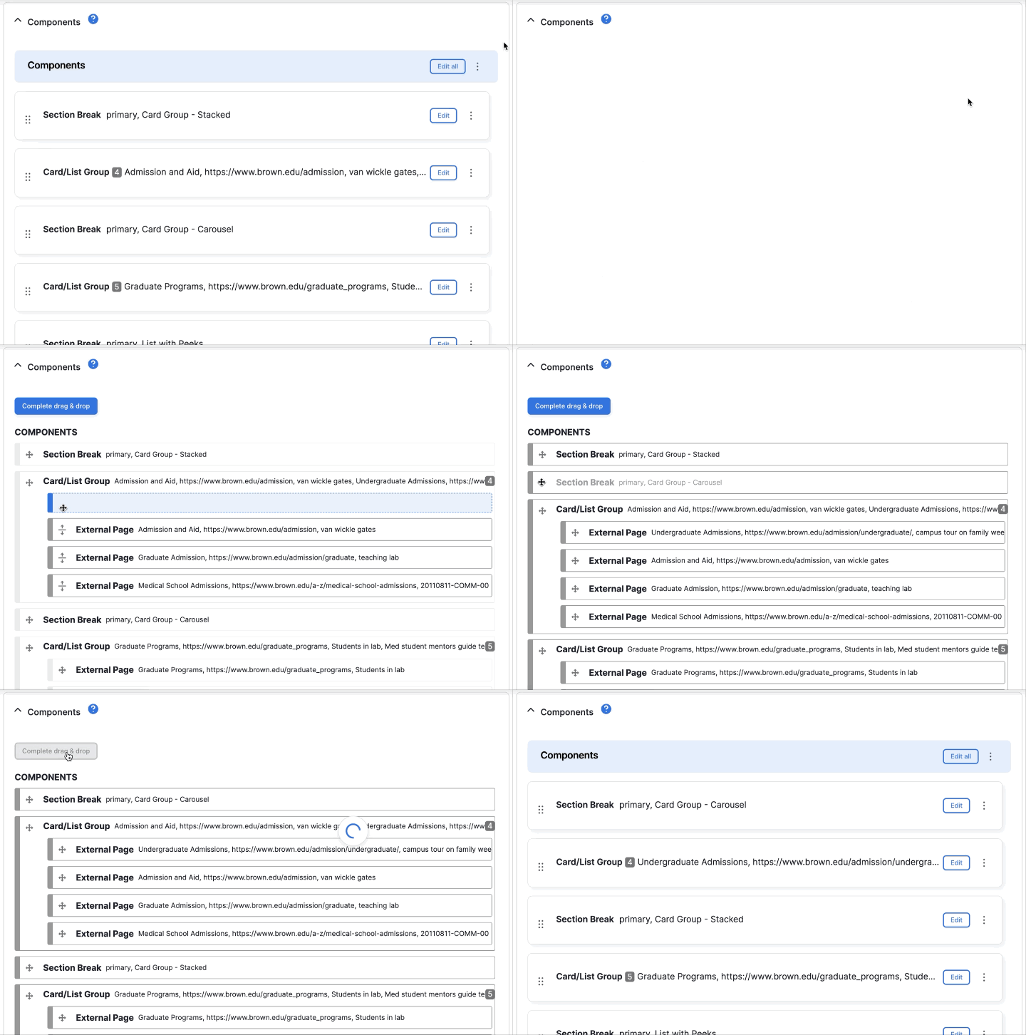
Easier Component Reordering
Rearranging components is easier in the new interface — particularly for pages or news stories with numerous components.

We are pleased to provide this early preview of the upcoming changes. You can learn more about the details and timing of the Drupal 10 in our announcement about the upgrade.