Guide to Drupal Interface Changes
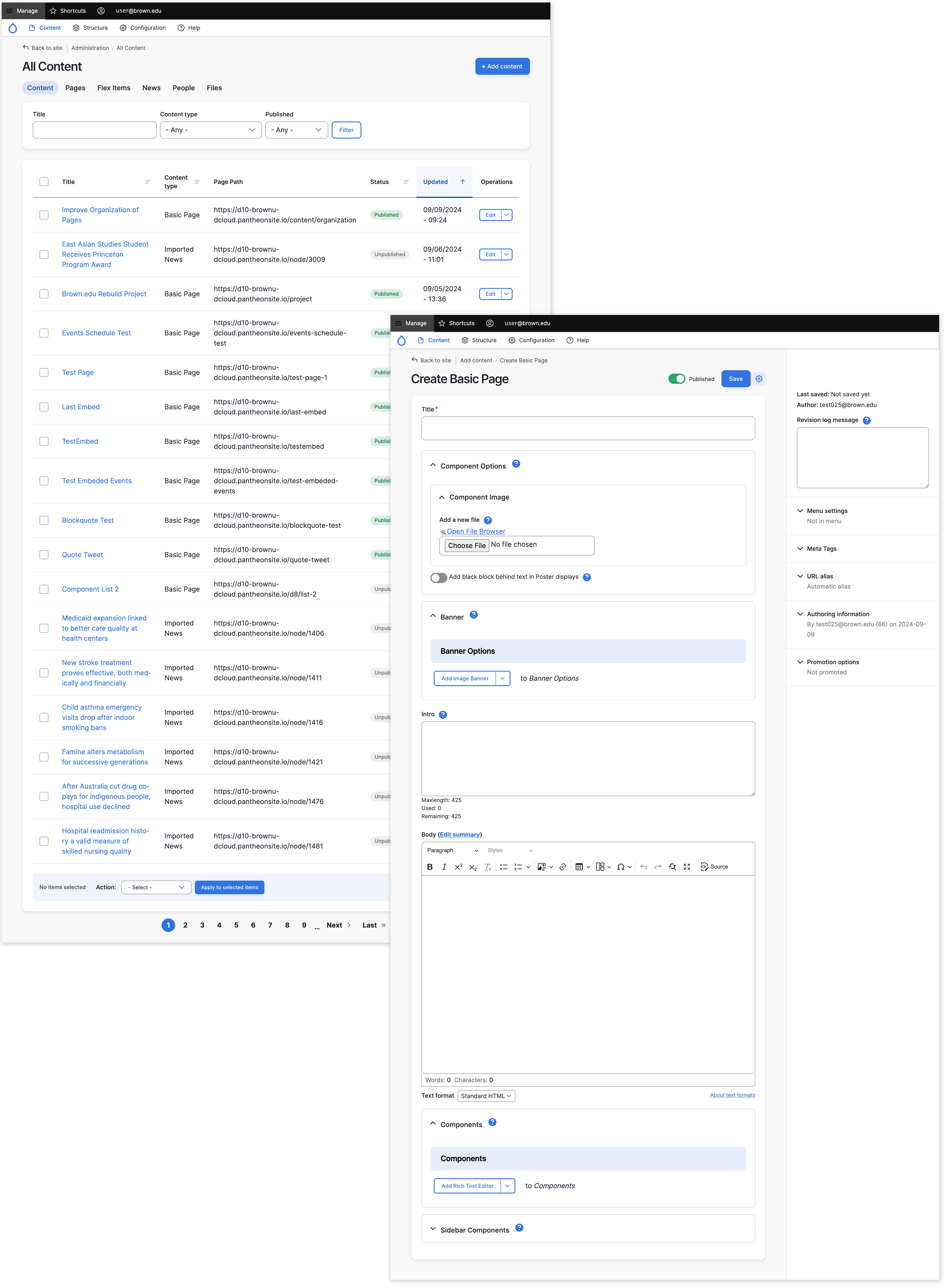
New visual appearance
The entire user interface for website editing received a comprehensive modernization. Given that the last significant update to Drupal's editing interface occurred in 2011, these enhancements will align the system with contemporary design standards.
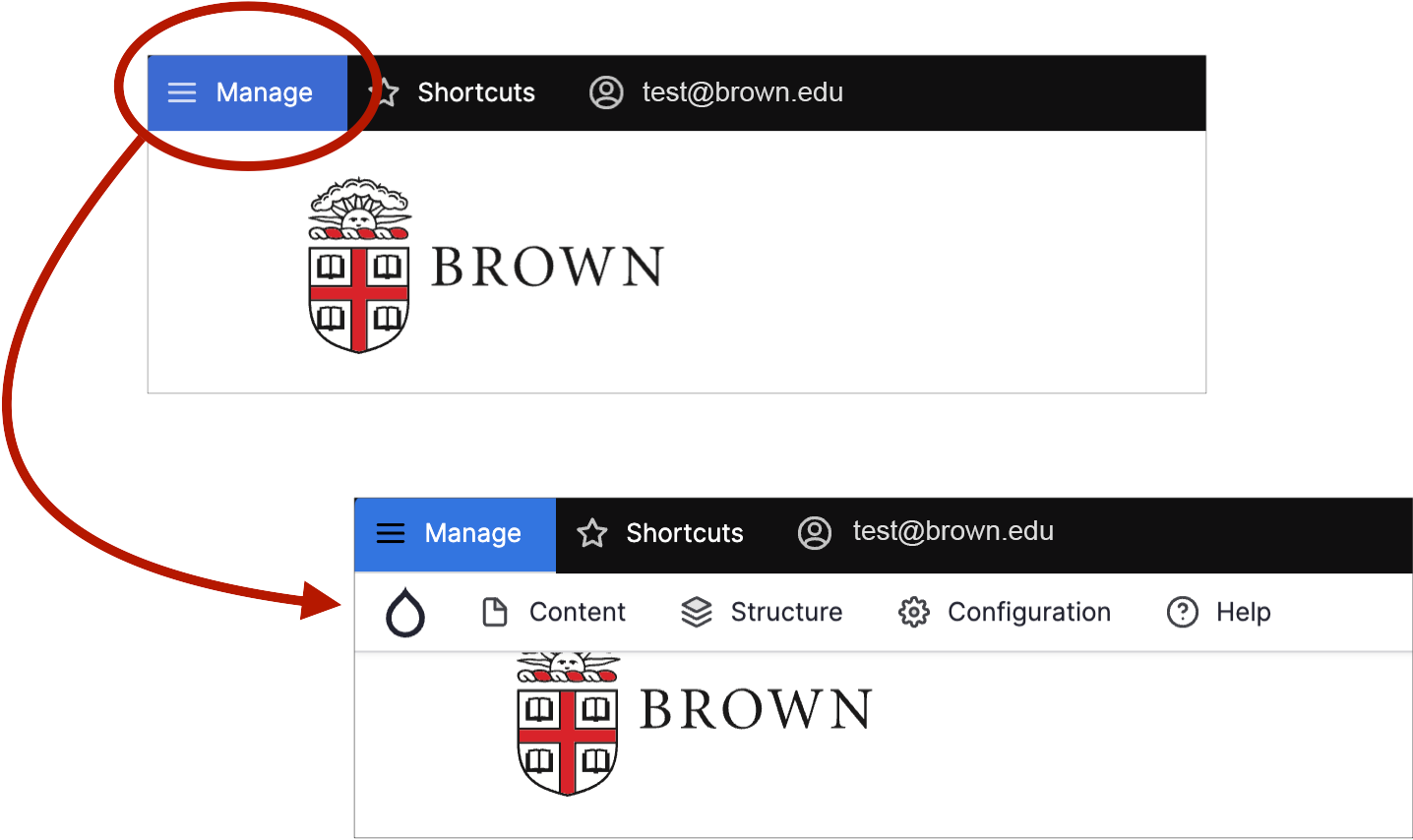
Toolbar toggle
When you first log in to a site, the editing toolbar may be closed by default. To see the full editing toolbar, click "Manage." In most cases, Drupal Cloud will remember your preference for an open toolbar on subsequent logins.
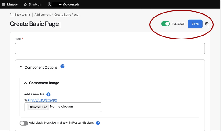
Save and publish buttons moved
- The publish toggle (previously a checkbox) is now located at the top of page.
- The Save button is also now located at the top of page.
- Both the Publish and Save controls anchor to the top of the page so you can access them regardless of where you are on the page.
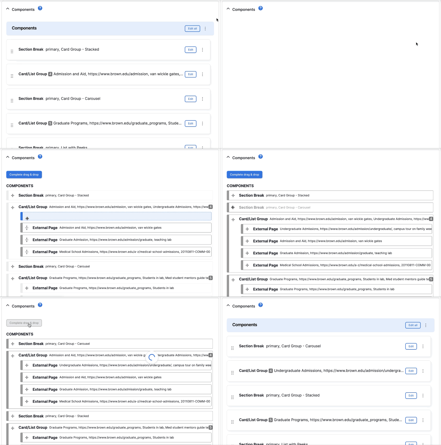
Easier component reordering
Rearranging components is easier in the new interface — particularly for pages or news stories with numerous components.
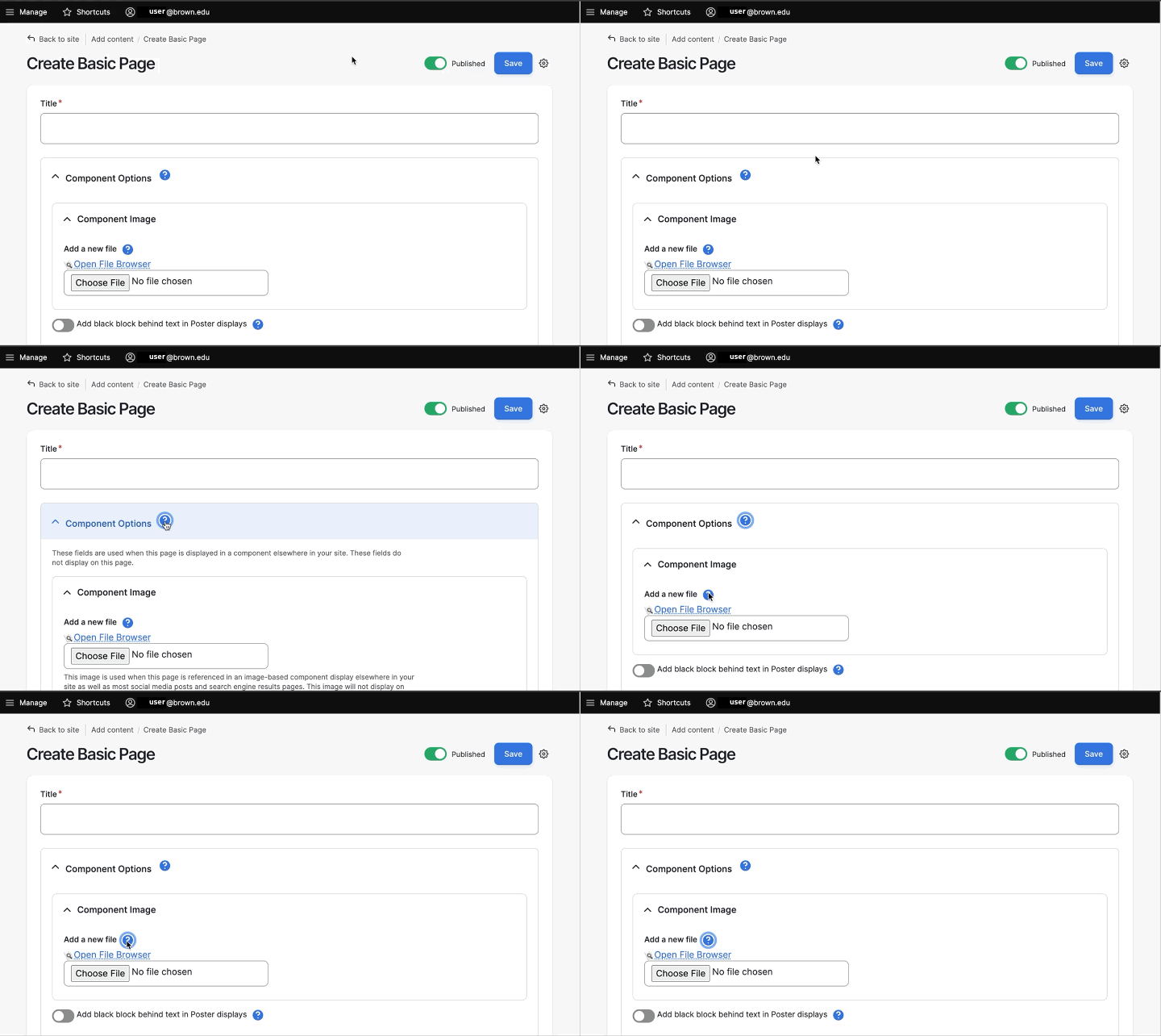
Help button
Help text is now minimized by default. If you need guidance, the help text is accessible via the “?” icon.
Updates to rich text editor
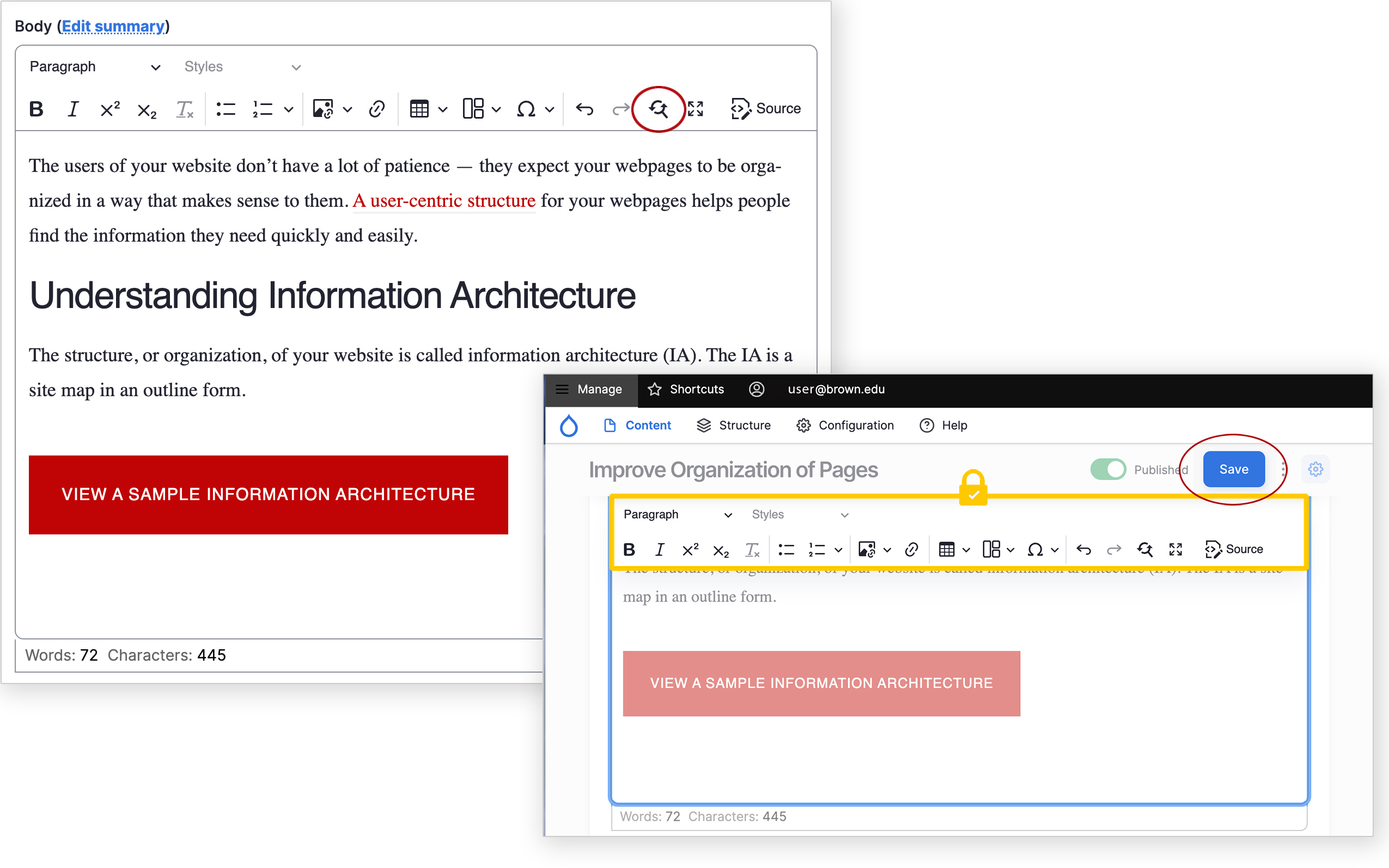
Rich text components have a number of new features to make creating and editing content easier.
The display of content when editing now more closely matches the public-facing view:
- Headings and paragraph text aligns with the size and font website visitors experience
- Links appear in the proper color
- Buttons, Link Groups and other applied styles display properly
We've also added new functionality, including:
- Find and replace to speed us editing tasks
- Word and character count to help gauge content length
- A 'sticky' toolbar to keep the editor buttons available when scrolling through longer content
- The Save button is also 'sticky' and is now located at the top of page
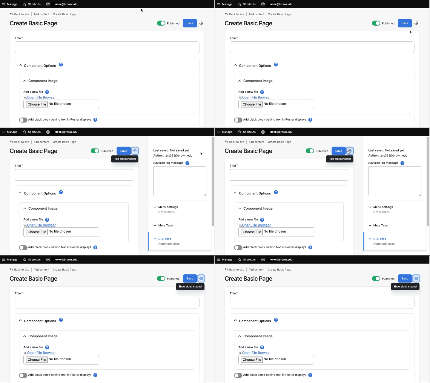
Side-panel display toggle
The right side-panel display can now be toggled open and closed. It is closed by default on small and medium width browser windows.
